Exposing myths about print ad readership
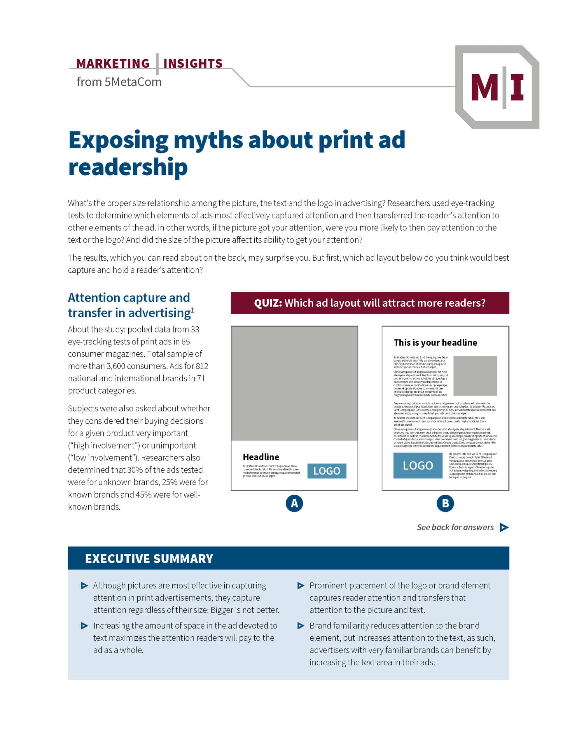
What’s the proper size relationship among the picture, the text and the logo in advertising? Researchers used eye-tracking tests to determine which elements of ads most effectively captured attention and then transferred the reader’s attention to other elements of the ad. In other words, if the picture got your attention, were you more likely to then pay attention to the text or the logo? And did the size of the picture affect its ability to get your attention?
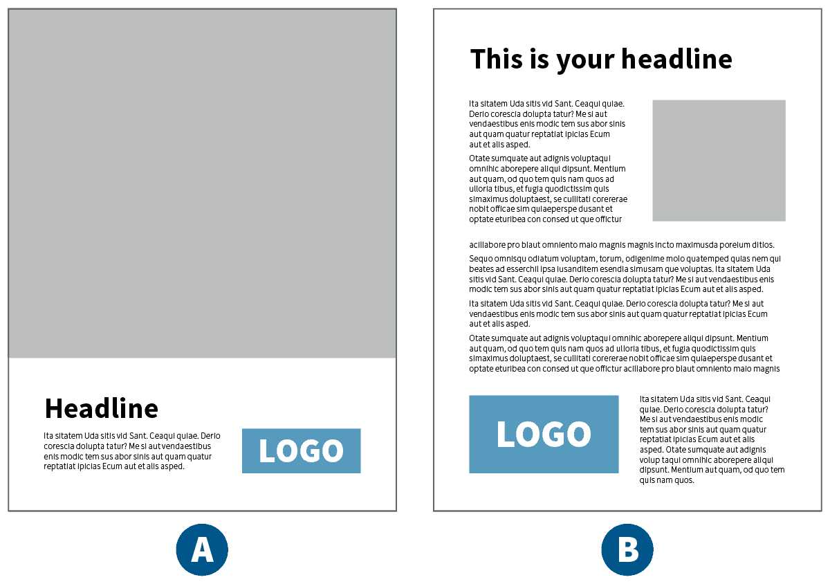
The results may surprise you. But first, which ad layout below do you think would best capture and hold a reader’s attention?
Attention capture and transfer in advertising1
About the study: pooled data from 33 eye-tracking tests of print ads in 65 consumer magazines. Total sample of more than 3,600 consumers. Ads for 812 national and international brands in 71 product categories.
Subjects were also asked about whether they considered their buying decisions for a given product very important (“high involvement”) or unimportant (“low involvement”). Researchers also determined that 30% of the ads tested were for unknown brands, 25% were for known brands and 45% were for well-known brands.
QUIZ: Which ad layout will attract more readers?

EXECUTIVE SUMMARY
- Although pictures are most effective in capturing attention in print advertisements, they capture attention regardless of their size: Bigger is not better.
- Increasing the amount of space in the ad devoted to text maximizes the attention readers will pay to the ad as a whole.
- Prominent placement of the logo or brand element captures reader attention and transfers that attention to the picture and text.
- Brand familiarity reduces attention to the brand element, but increases attention to the text; as such, advertisers with very familiar brands can benefit by increasing the text area in their ads.
The surprising truth about how your readers see your ads
The attention capture and transfer study yielded several results that most marketing and advertising professionals might expect: Ads placed more toward the front of magazines garnered more attention than ads in the back of the magazine; ads for “high involvement” products held attention better than ads for “low involvement” products; and readers paid less attention to ads for products that were more familiar.
But some of the results were more surprising:
- The pictorial element in the ad was best at capturing attention, regardless of size. An increase in the size of the picture did not increase attention to the ad as a whole.
- Increasing the amount of space devoted to text in the ad increased attention to the ad, and ads for “high involvement” products gained more from increasing the size of the text element than “low involvement” products.
- Although readers were inclined to pay less attention to ads for particularly familiar products, increasing the text element in ads for familiar products invited closer scrutiny.
- The logo, or brand element, is best at transferring attention to the other parts of the ad. In other words, when the logo attracts attention, readers pay more attention to both the picture and the text.
Using the results to make better ads
Include a picture (any size) in your ad — The study shows that, while the picture is important, the size of the picture doesn’t matter; a small picture will capture attention just as effectively as a large one.
Copy: more is better — Increasing the area of the ad devoted to text is the most effective way to maximize attention to the ad as a whole. The idea that readers aren’t interested in the copy is clearly untrue; in fact, the more familiar your product, the more you stand to gain by devoting more space to text.
A big logo helps — The old idea that “readers will turn the page faster once they realize it’s an ad, so we should make the logo small” turns out to be untrue as well. A prominent brand element helps capture attention and can actually route attention to the picture and text, inducing readers to spend more time with the ad.

Do magazine readers really read the ads? — Another interesting bit of news from the study: On average, readers spent only one more second gazing at editorial content than at advertising (ads: 1.73 seconds, editorial: 2.79 seconds in “gaze duration”). Don’t believe a browsing reader doesn’t have time for your ad. It will be noticed.
Quiz Answer
Ad “B” should attract more readers because:
- It has more copy.
- It has a larger logo (brand element).
Don’t be fooled by the large photo in ad “A.” Remember: Having a picture is important. Size of the picture isn’t.
1 R. Peters & M.Wedel, “Attention Capture and Transfer in Advertising: Brand, Pictorial, and Text-Size Effects,” Journal of Marketing, April 2004.
