Creating ads with “stopping power”

About the study
Trade magazine readers evaluated 996 business-to-business print ads in 45 industry publications. Subscribers were mailed their current issue as scheduled; two weeks later, randomly selected subscribers were mailed the same issue again. These recipients were asked to go through the issue again and answer questions about whether they remembered seeing specific ads. The study was based on the first 100 responses received.
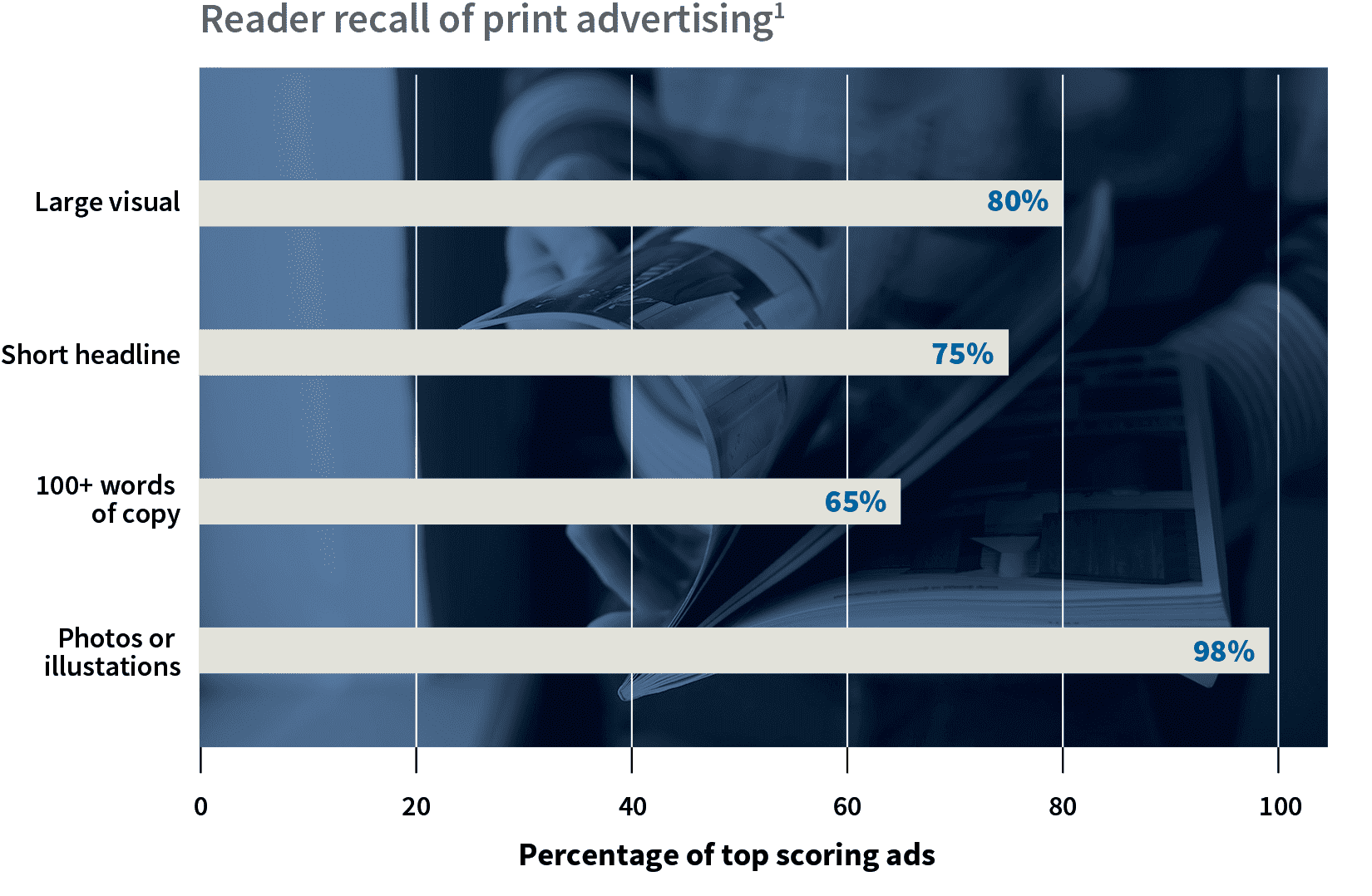
Most business-to-business magazine readers best remembered ads when they featured large visuals, short headlines and 100 words or more of descriptive copy.
EXECUTIVE SUMMARY
- Print advertising with large visuals, succinct headlines and descriptive, benefit-oriented copy yielded the highest recall.1
- The inclusion of a photo or illustration in the ad was by far the most important factor in recall; 98% of the top-scoring ads in the study included a photo or illustration.1
- Headline length in 75% of top-scoring ads was 1–12 words, with 36% having only six words or fewer.1 Nearly two-thirds of top-scoring ads did not use subheadlines.2
- Business-to-business readers want benefit-oriented body copy. 65% of top-scoring ads included 100 or more words of body copy that stressed product benefits.1
Working with the elements of effective print advertising
According to research, here are the elements that produce the most “stopping power” in print advertisements:
Photos or illustrations
- 98% of most-recalled ads included a photograph or illustration.1
- 80% of top-scoring ads featured a dominant visual — from one-quarter to more than two-thirds of the ad space.1
Short headlines
- 98% of most-remembered ads featured headlines.2
- 75% of top-scoring ads used headlines of twelve or fewer words, with 36% having six or fewer words.1
- Only 10% of top-scoring ads used a typeface larger than one inch, while 59% used a half-inch or smaller typeface.1
- 62% of top-scoring ads did not use subheadlines.2
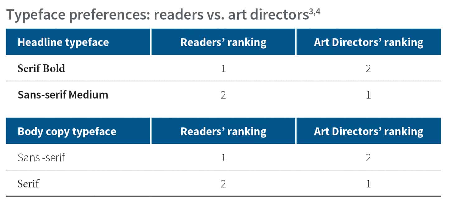
- Readers preferred a serif typeface for headlines, while art directors preferred a sans-serif medium typeface.3
Descriptive copy
- 65% of top-scoring ads included 100 or more words of copy describing the advertised product’s business benefits as they affected the reader’s specific job responsibilities.1 (How much is 100 words? The amount of body copy in the seven bulleted points here above “Descriptive Copy” consists of 105 words.)
- Top-scoring ads typically featured copy that stressed product benefits by highlighting features and supplier capabilities.1
- For body copy, readers preferred a sans-serif typeface, while art directors preferred a serif typeface.4 Preferences by art directors might be attributable to legibility studies where sans-serif typefaces minimally outperformed serif typefaces.

1 Cahners Advertising Research Report No. 118.5; Characteristics of Top-Scoring Advertisements in Specialized Business Magazines, (2002) Cahners Publishing Company.
2 Cahners Advertising Research Report No. 1310.7; Which Features Appear In Headlines Of Top Scoring Advertisements In Specialized Business Magazines? (2002) Cahners Publishing Company.
3 Cahners Advertising Research Report No. 1310.5; How Typefaces Are Ranked Overall By Specialized Business Magazine Readers vs. Art Directors For Headlines, (2002) Cahners Publishing Company.
4 Cahners Advertising Research Report No. 1310.6; How Typefaces Are Ranked Overall By Specialized Business Magazine Readers vs. Art Directors For Body Copy, (2002) Cahners Publishing Company.
